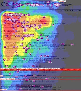
In new media, readers quickly scan your copy, looking for important info at the upper left. Put your facts in the 4 to 6 words of copy closest to the left margin because that's what readers are most likely to see.
The heat map measures eyeball movement. Read it like a weather map, with red indicating the most intense areas of visual engagement, followed by orange, yellow, and...you get the picture. The heat map confirms that most readers only "see" less than a quarter of the precious copy we slaved over.
So: put your story where those eyeballs are, in the upper left and at the start of copy lines. Pack your key words in there, to reassure readers that this is an article they want to read; they searched for those key words and need to see them, or they'll click away.
It's not enough to produce good content; we have to put it where it will be seen. Visit http://csscreme.com/heat-maps/ to see how heat maps can help you position web design elements as well.


No comments:
Post a Comment